-
.jpg)
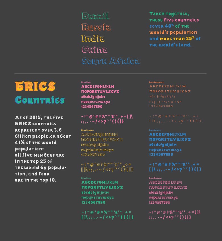
ZAR font family in use
-
.jpg)
ZAR font family in use
-
.jpg)
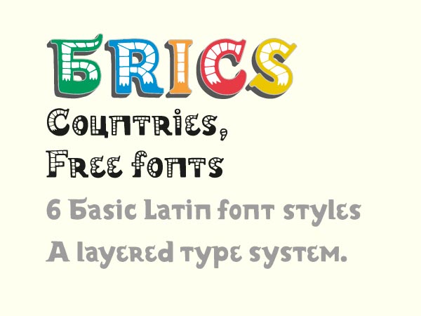
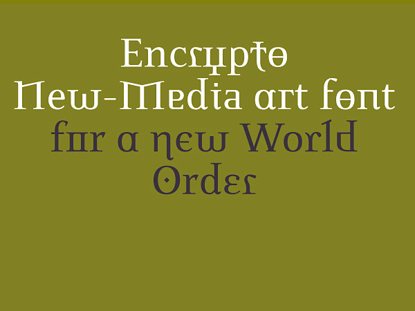
NeoFeudalism and Ethereum font famileis in use
-
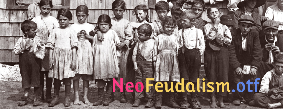
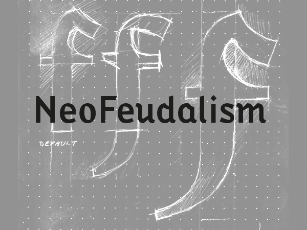
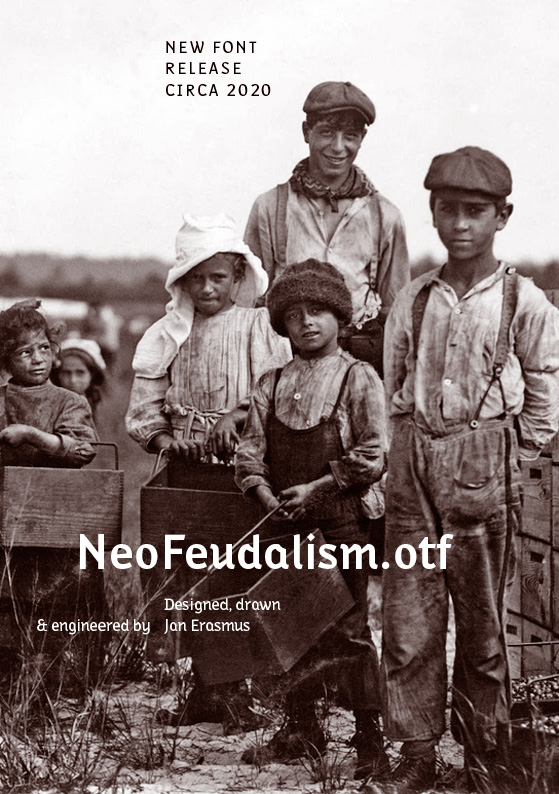
NeoFeudalism fonts - Photo detail, Lewis Hein 1911
-
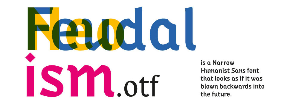
NeoFeudalism Regular, Bold and Black
-
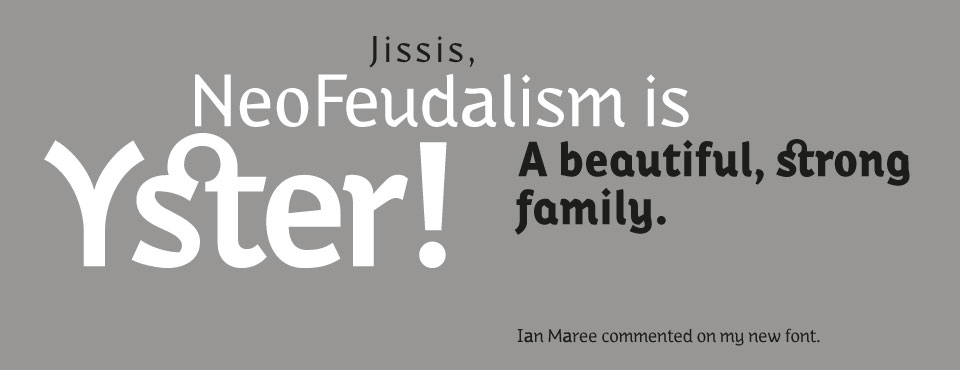
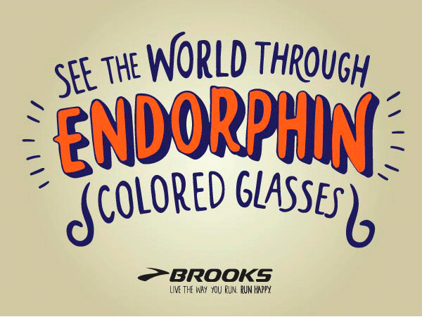
NeoFeudalism seen in use
-
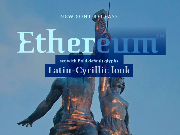
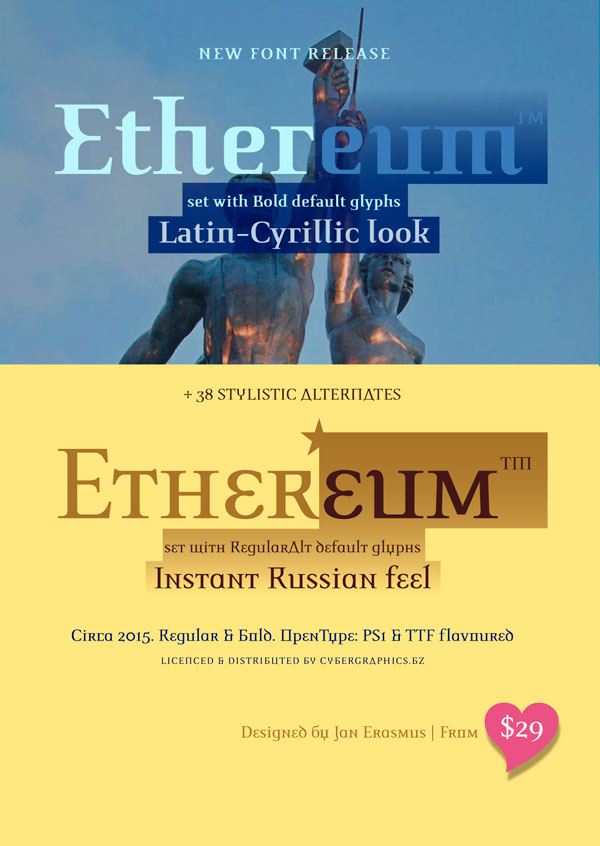
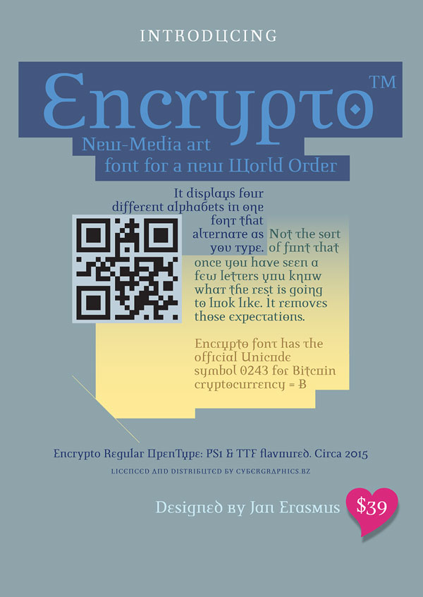
Ethereum fonts in use
-
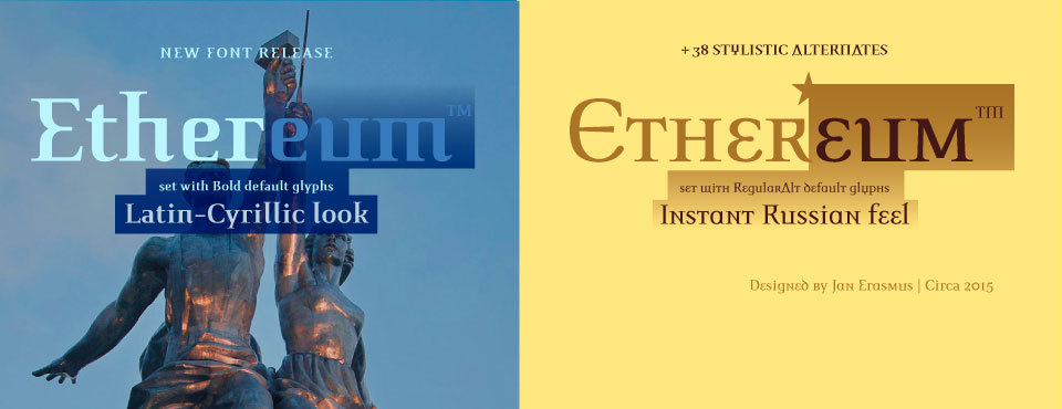
Ethereum
-

Seen in use
-
The new Campbell-Stencil font
-
A co-op production between iceberg.co Auckland and cyberGraphics, Johannesburg
-
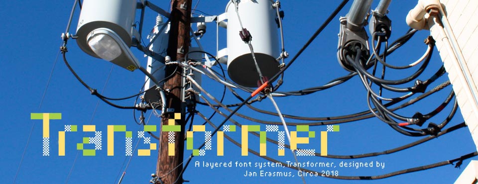
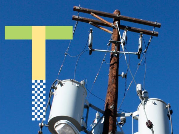
Transformer layerd system font family
-
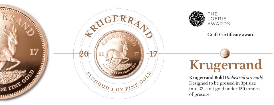
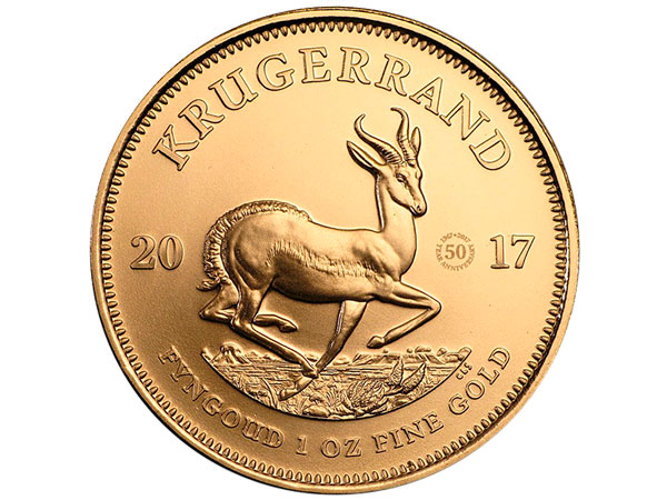
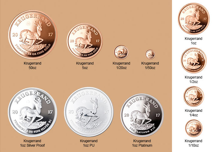
Krugerrand 50th Aniversary fonts in 4 styles
-
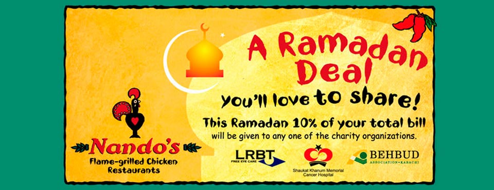
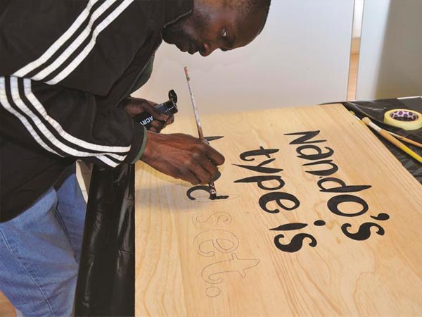
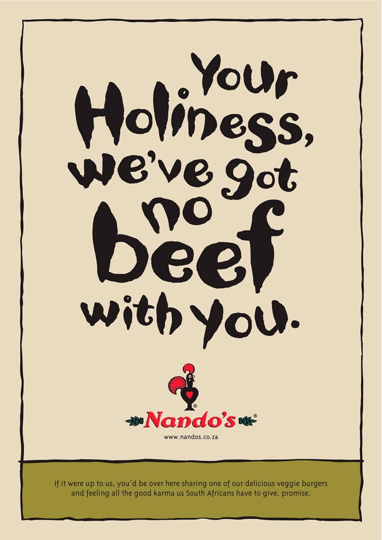
Nando's Billboard
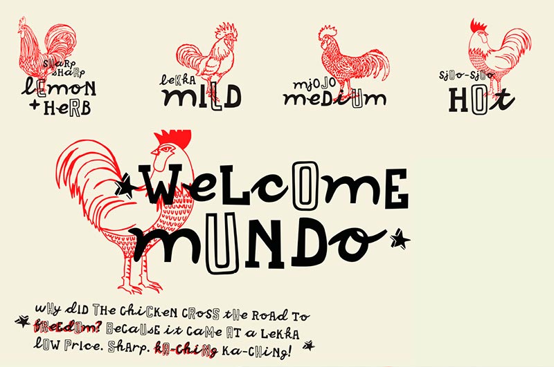
-
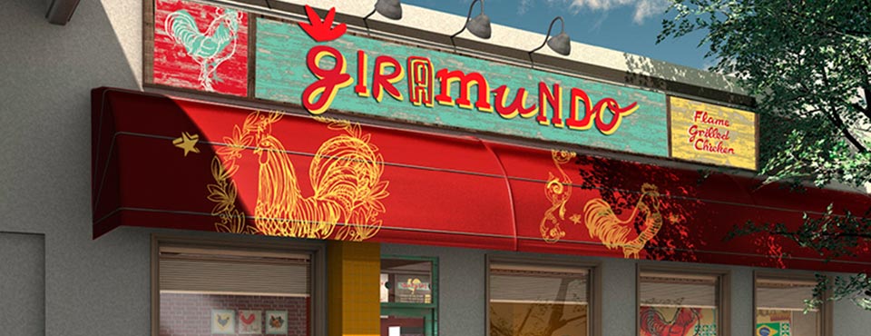
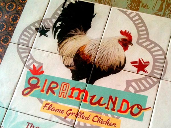
Giramundo font for signage
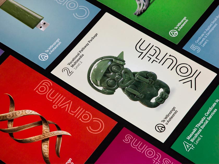
-
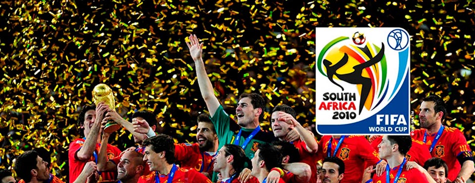
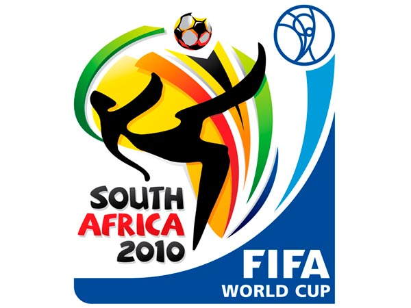
Menyaka font for FIFA SA Worldcup
-
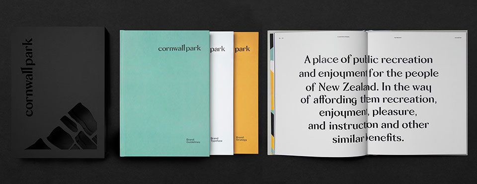
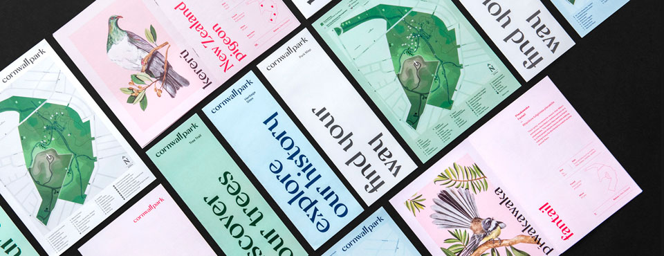
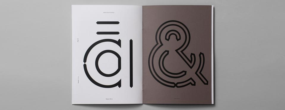
A co-op production with Stategy, Wellington, NZ
-
A co-op production with Stategy, Wellington, NZ
-
A co-op production with Stategy, Wellington, NZ
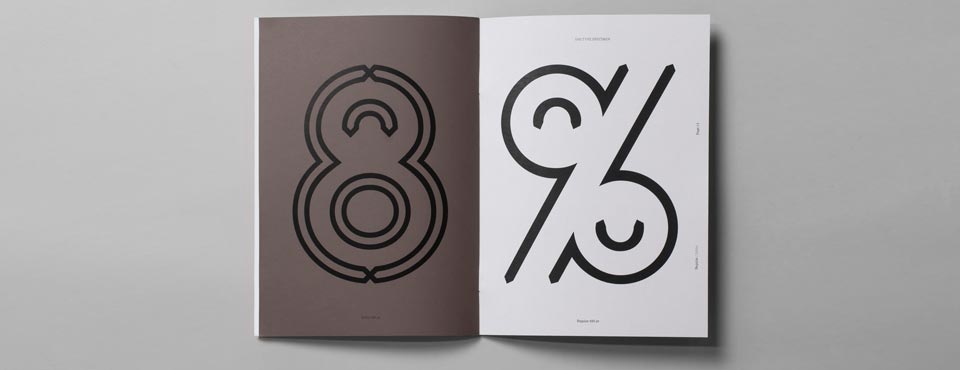
-
A co-op production with Stategy, Wellington, NZ
-
A co-op production with Stategy, Wellington, NZ
-
A co-op production with Stategy, Wellington, NZ
-
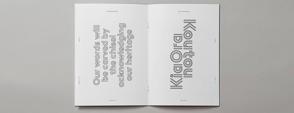
A co-op production with Stategy, Wellington, NZ
-
-
-
-
-
-
-
-

-
-
-

-

-
 s
s
-
-

-
-
-
-
-
-